Styling Stationery Flat Lay
Before I became a full-time designer, I was a social media specialist for a small retail shop. My job required me to frequently update the shop's social handles including Instagram, Facebook, email newsletters and the blog. This meant I needed to constantly photograph fresh new content to post on all of the different channels all while keeping it on-brand. Visual content creation was a lot of fun for me and it really taught me how to style for product shots and flat lays. It has been especially handy now that I'm a stationery designer so I wanted to share some of my tips and tricks on styling flat lays! Keep in mind that this post is specifically for styling paper goods. You can certainly apply these tips with non-paperie items as well but it may vary depending on the product you are shooting!
1. Play with scale
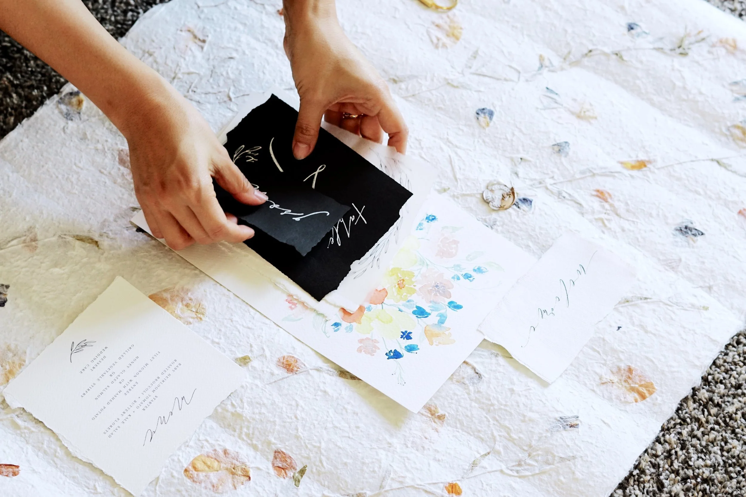
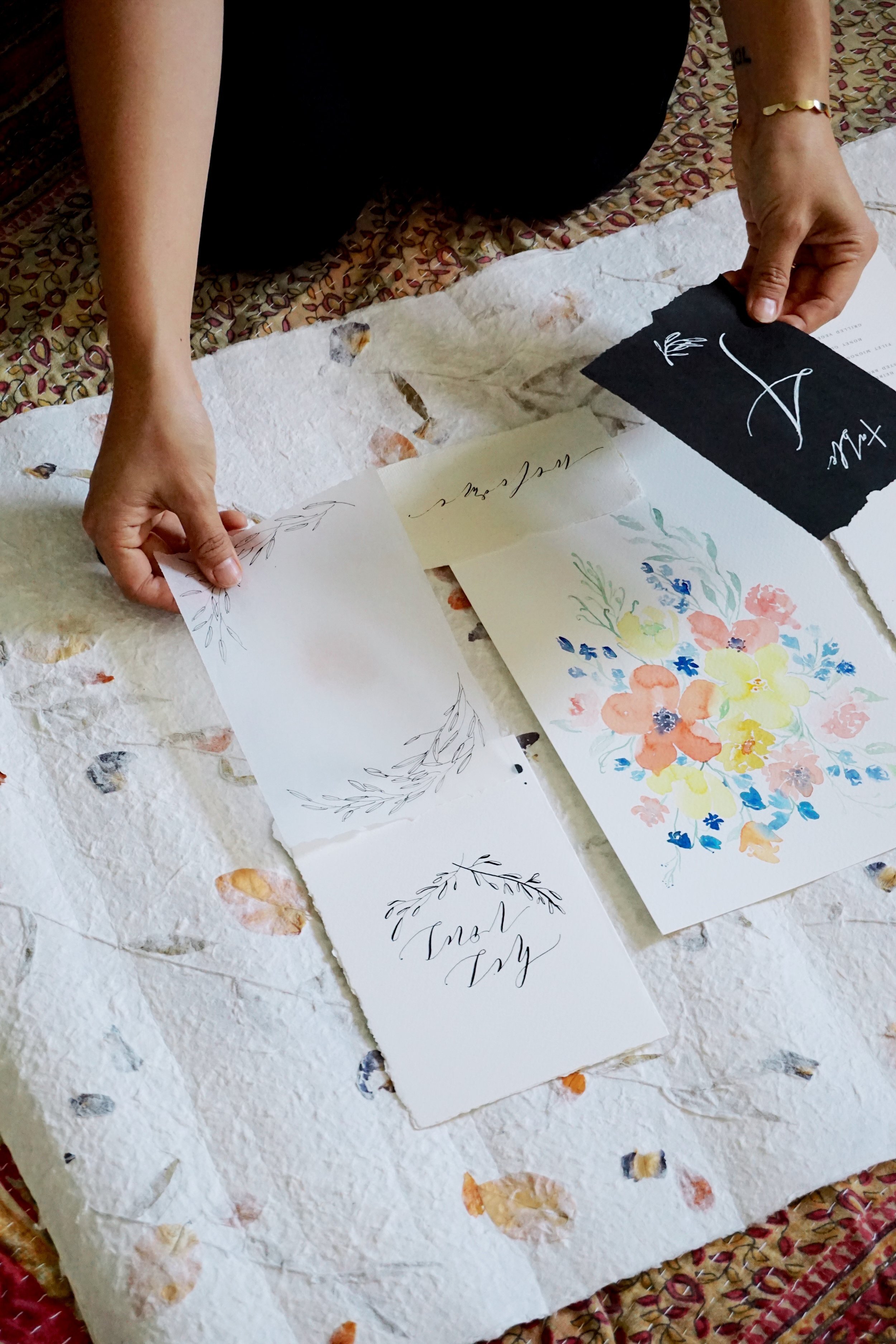
Since paper goods are usually flat, having a variety of sizes helps add visual interest and dimension to a flat lay. Before starting, I like to lay out all of the paper items to see what I think would look good together. Once I've selected the items I want to use, I start by placing the largest piece first before adding in the other items. Keep the smallest items for last and overlap some of the pieces to create additional depth.
2. Create a balanced composition
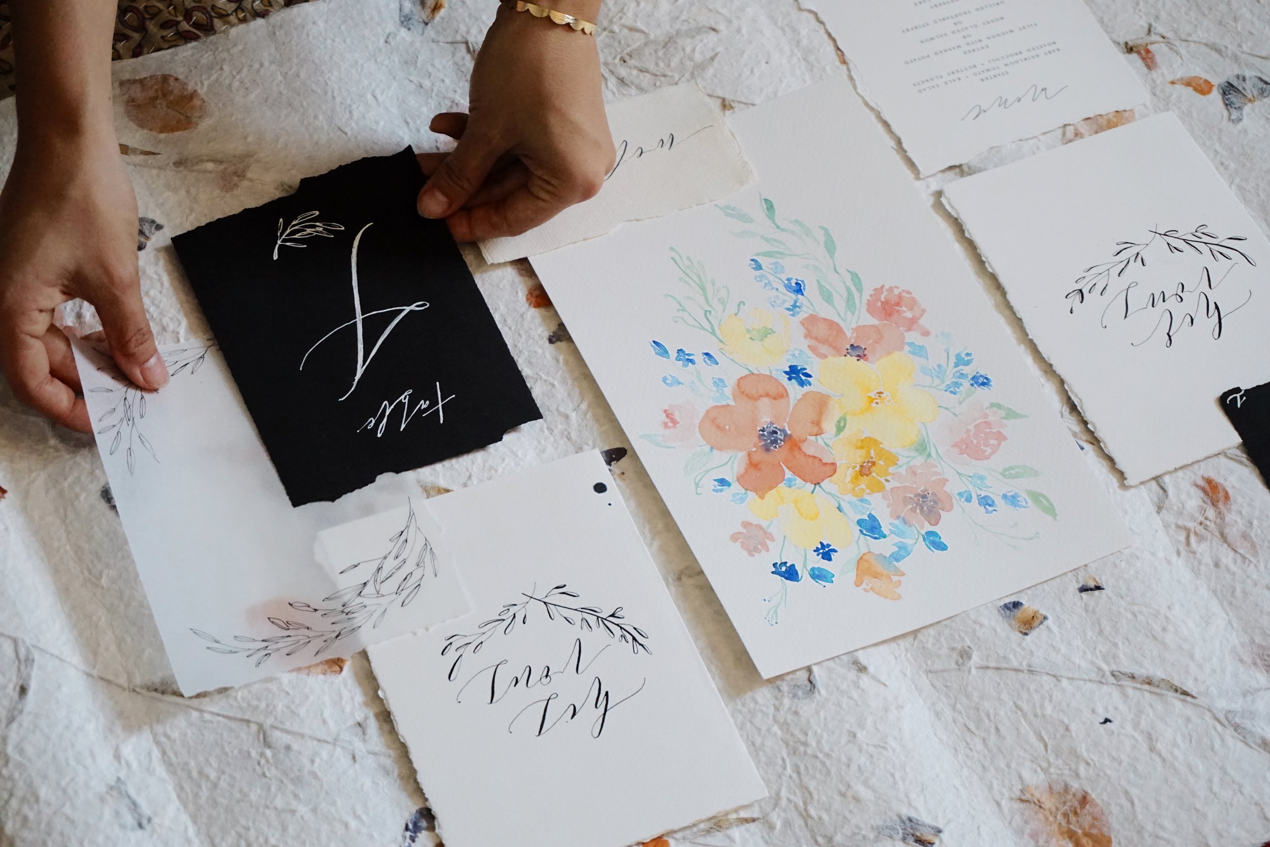
My florist friend once told me that the human eye takes in information from left to right. This is obvious for when you're reading text but it also applies for visual imagery. When looking at an image, our eye naturally goes from left to right, top to bottom. When styling a flat lay, you want to keep that in mind so all of the items has a nice flow. You don't want the overall composition to be too heavy on one corner. Instead, try to place items so that the overall layout has a nice balance from edge-to-edge. For example, my escort card and table # is stark black so your eyes automatically goes to those two pieces. I spaced them out by having the escort card on the top left corner and the table # on the bottom right corner so they are evenly distributed.
3. Mix it up with textures
There are so many different type of paper stocks like smooth cover, cotton rag, and deckle edge paper! I love incorporating handmade paper when styling flat lays because it instantly adds visual interest and creates that "fine art" feel. In my photos, I'm using a sheet of handmade paper with pressed petals as my backdrop. On top, I have a mix of watercolor paper, origami paper and vellum. If I'm working with an interesting backdrop, I like to add a piece of vellum so the details peek through slightly. Rice paper or tissue paper are also great options for translucent paper. If you don't have deckle edge paper, you can create it yourself with a straight edge ruler or by burning the edges with a lighter, which is what I did with my black card items. Just be careful not to burn your fingers (or anything else!)
4. Know your color story
Colors play a huge role in create the mood of your flat lay. You can create something dark and moody or colorful and playful! Because my work primarily focuses on watercolor, mine tend to be more on the playful side. I love incorporating pops of color while keeping it simple and sophisticated so I try to keep that style throughout my flat lays. For this particular shoot, I wanted my floral watercolor piece to be the focal point so I paired it with black and white stationery items. To go along with the organic elements of the floral painting, I used a backdrop that had pressed petals with similar hues.
5. Accessorize with props
I love adding little props to flat lays so it looks more "lifestyle" than straight-on styled. Props help tell a visual story of the item that is photographed. For example, I love adding paint brushes next to a finished painting or a wax seal stamp next to a sealed envelope. It's like you're inviting the viewer to be a part of the process and that makes it a bit more interactive. You can use props to help guide the viewer's eye from one item to the other. Just keep in mind to not go overboard. Props are accessories that should help highlight the stationery items, it should not compete for the spot light. Some of my favorite props are miniture scissors, bobbins, ribbon, and foliages.
6. Chase the light
Now that you have a beautifully styled flat lay, you need to photograph it! This is a no brainer when it comes to photography - natural lighting is key. It's especially important for photographing stationery items because designs can easily get washed out by lighting. If you're indoors, set up your flat lay by the window or if you're outside, take it in the shade to avoid harsh lighting. If it's windy out, use props as weight or use masking tape to hold down your paper goods!
& there you have it, those were my 6 tips on styling flat lays! These are general tips that I learned while styling for visual content creating and I hope you found it useful.
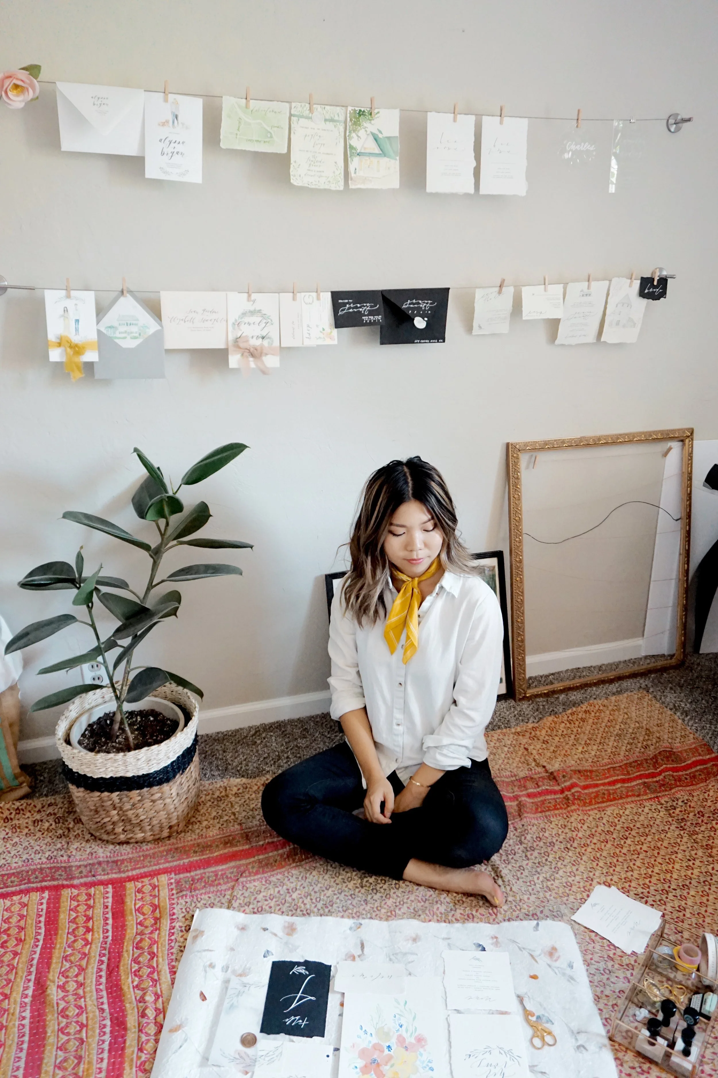
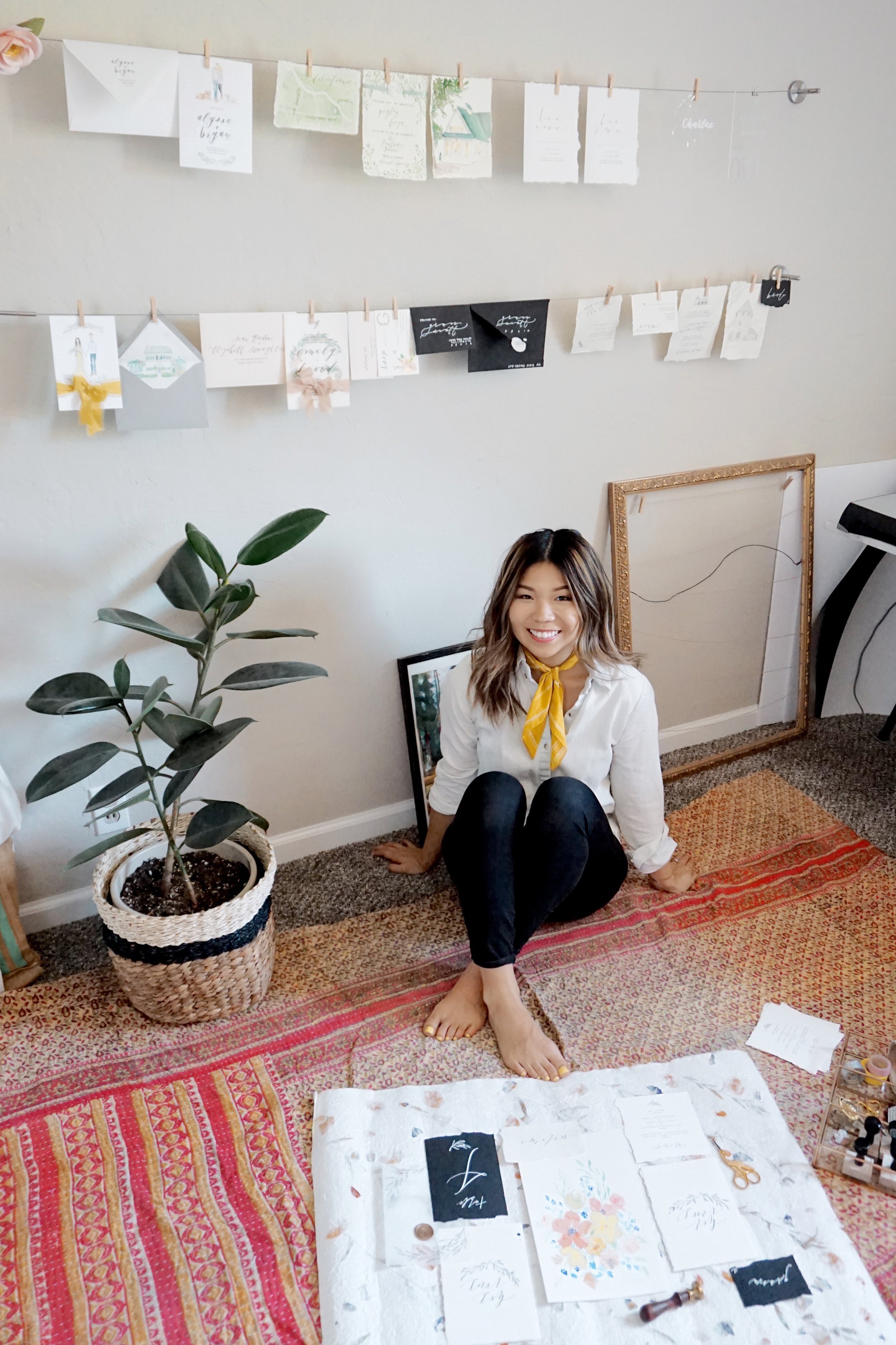
Personally, I only started creating flat lays of my work a few years ago. As a stationery designer, I often design in the studio and ship off the finished work, never to be seen again. I rarely get to see my finished work in action nor receive photographs of it being used so I decided to shoot them myself. If you are a stationery designer or an artist, I would definitely recommend you do this as well!
If you have styling tips & tricks, I'd love to hear them as well! Leave a comment down below or email me directly :)
Photography by Kimmie Harper